Department
BrandingService
- (019)Logo Design & Strategy
- (020)Package & Material Design


We blend strategy, creativity, and technology to help brands grow, connect, and stand out in an ever-evolving digital world.





One group. Very different challenges.
Department
BrandingService
Department
Content MarketingService
Department
Website DevelopmentService
One name. A lot underneath it.
Lion didn’t come to us with one brief.
It came with a group of companies spanning financial services, tea, energy, agriculture and corporate operations, each with a very different job to do.
We needed to create a website here, a corporate identity there and 30+ tea packaging designs somewhere else.
We needed to create one master identity that could hold together very different businesses coming from diverse sectors, while giving each one enough space to feel like itself.
Department
Service
The job was to give Lion Holdings an identity that could sit above multiple businesses without looking like it belonged to any one industry.
We built a clean, structured corporate identity designed for flexibility with no heavy lean into finance, no obvious agricultural cues, no visual language tied only to FMCG or energy.
The company profile gave the wider Lion ecosystem somewhere to make sense. We structured it around the organization, its businesses and the services around them, turning a dense corporate document into something much easier for partners and stakeholders to understand.
The parent brand got its own voice. The businesses underneath got room to breathe.
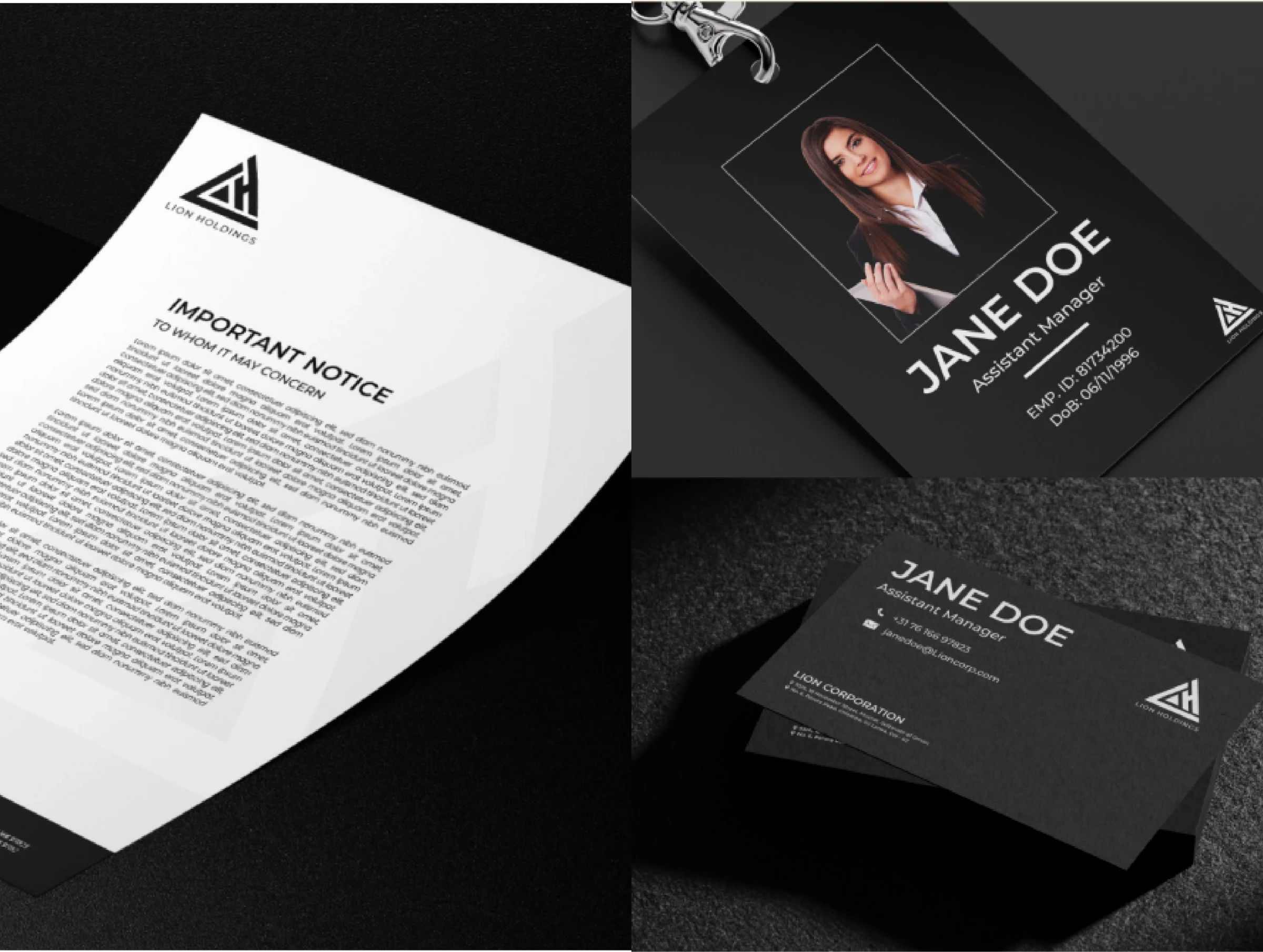
No cookie-cutter master brand.
The identity had to be broad enough to move comfortably across digital, print and corporate applications.
That meant building a system that felt structured and credible without forcing every company in the group into the same visual language.
Department
Service
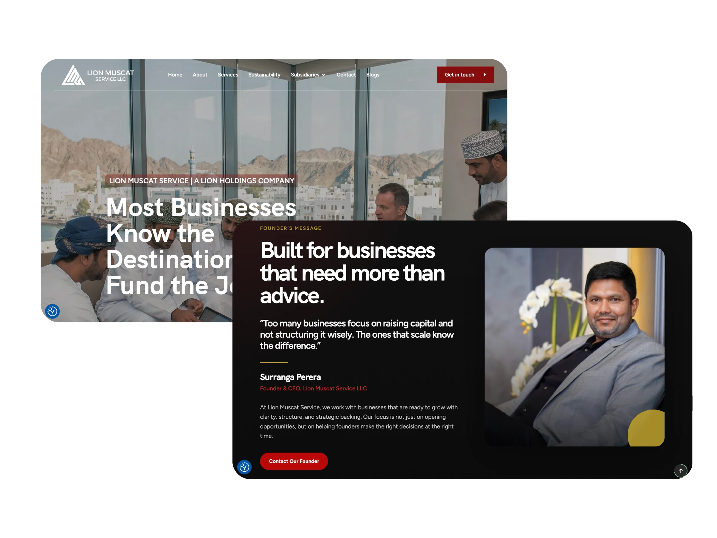
Lion Muscat Service operates across financial advisory, investment structuring and other complex services, which meant the website had to earn trust quickly while making a lot of information feel simple.
The constraint was 48 hours. Design. Content. Creatives. UX. Development. Responsive build. Launch. All of it.
The site was structured around the services people needed to understand, with a polished corporate look suited to a business operating across the GCC.
Just because a website needed to be fast, it didn't mean throwing things together. It meant understanding what exactly mattered and getting there quickly.
Lion Muscat Service needed clarity fast.
The website gave a complex financial business a more complete digital presence.
The structure, content and visual direction were all shaped around helping external audiences understand the services quickly and trust the company behind them.
Department
Service
Financial advisory, investment and business information, organized for external stakeholders.
A deeper look at the people behind LMS and its related businesses.
Department
Service
Making the Lion feel corporate.
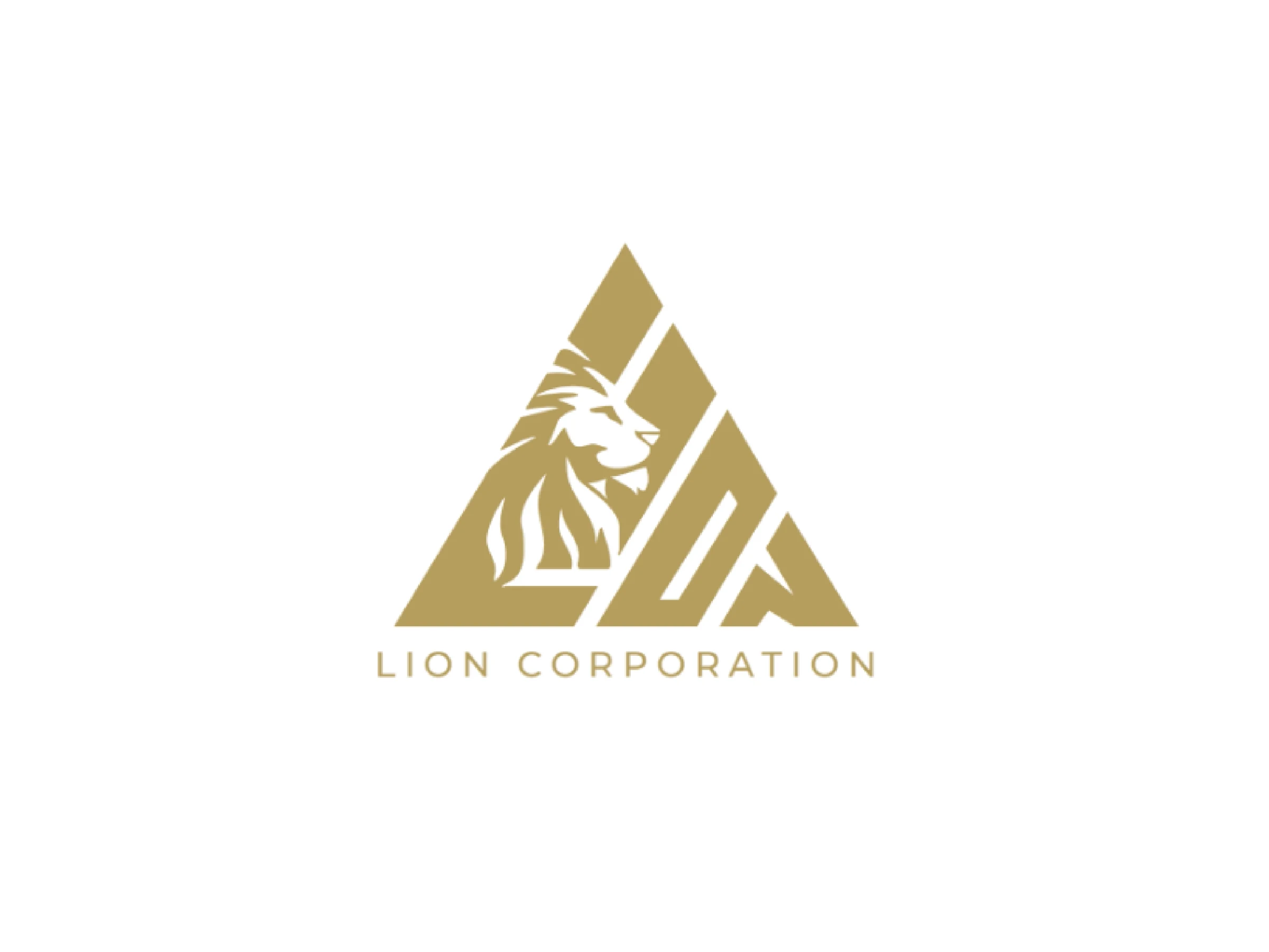
Lion Corporation’s identity needed to reflect that it could carry weight at a corporate level but still clearly belong to the wider Lion family.
The answer was a structured lion head built into a triangular form, bringing the symbol, framework and company name together into one mark.
We supported it with logo variations, typography rules and practical applications across corporate and digital material.
The result was a corporate identity that could stand on its own without losing the Lion connection.
Same Lion. Different territory.
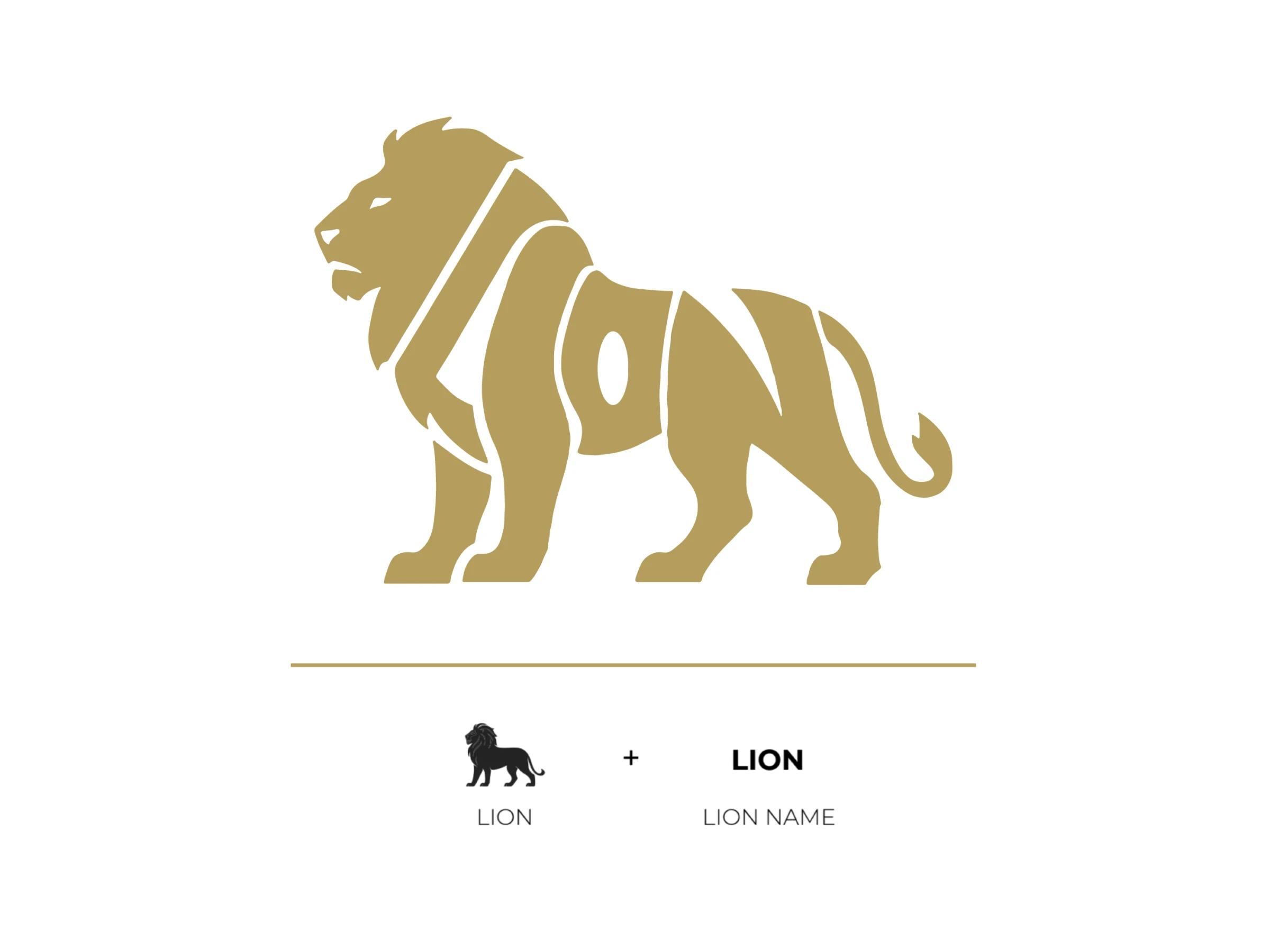
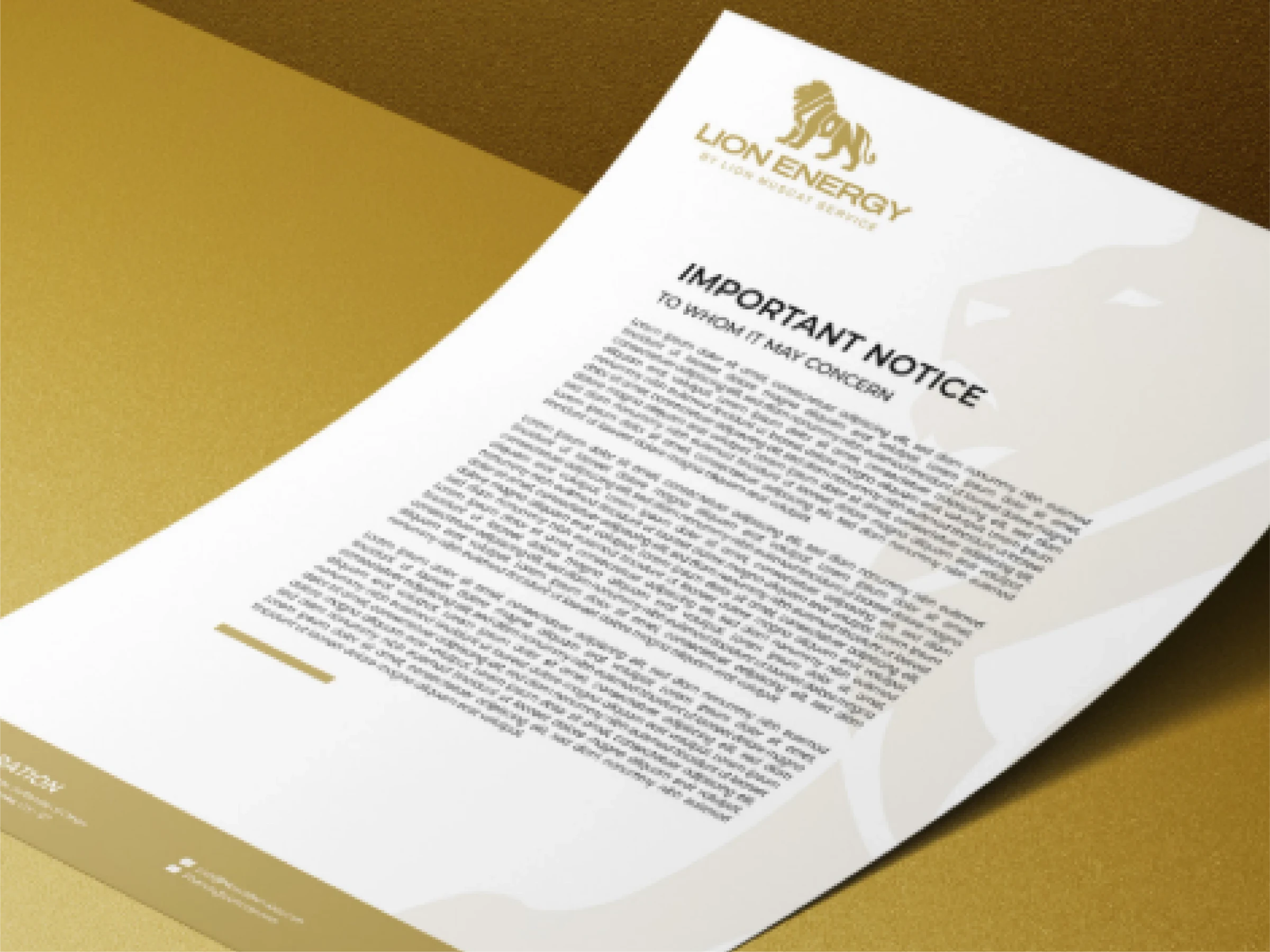
Energy needed a different kind of presence. We approached it with a more technical angle, more operational. Still Lion.
The full lion figure became the anchor because it gave the identity more movement and presence, while keeping the execution clean enough for a serious B2B environment.
The system then extended across logo variations, typography, color and corporate applications because Lion Energy had plenty to carry, from lighting to electrical solutions and specialist products and services.
Department
Service
The challenge wasn’t a lack of information. There might have even been too much of it.
Lighting could range from decorative fittings to stadium-scale systems. Electrical moved into infrastructure and high-voltage equipment. Instrumentation covered monitoring, control and technical hardware.
Instead of dumping everything into one document, we created clearer service sections, built a stronger information hierarchy and carried the new identity consistently throughout.
Department
Service
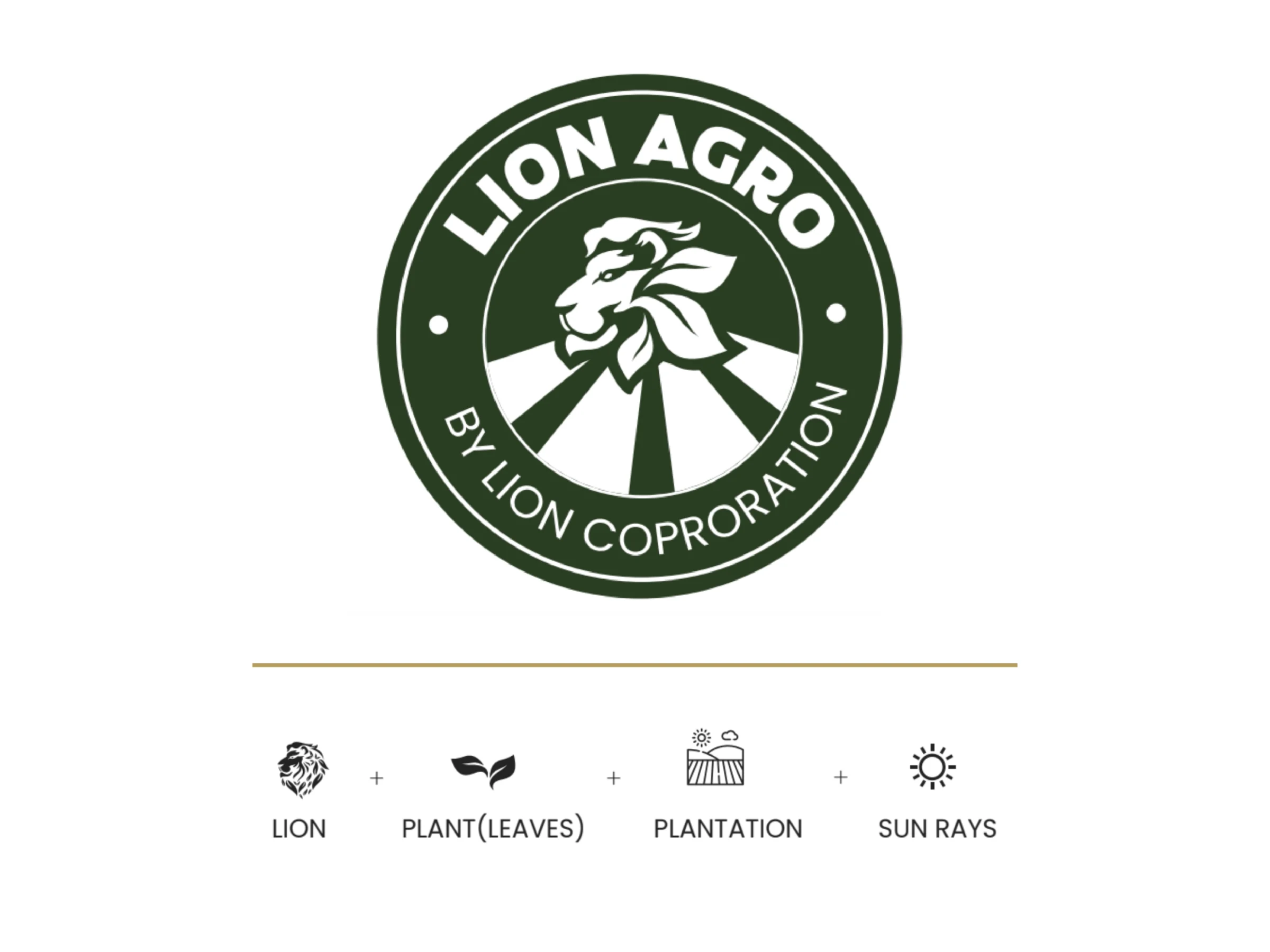
Lion Agro couldn’t simply borrow the existing Lion identity and call it a day. Agriculture needed to come through immediately.
So we rebuilt the mark around the category. The emblem brings together the lion, leaves, plantation lines and sun rays.
The circular structure gives it a more grounded agricultural feel, while the deep green, warm off-white and black palette carries the idea across the wider identity.
Still Lion. Clearly Agro.
A growing collection of distinct brands and practical tools.
Developed identities tailored to their own industries.
Expanded through company, management and board profiles.
Gained a fully developed digital presence for a complex financial business.
Turned a 30+ design packaging project into an international trade showcase and a platform for B2B conversations.
Consistency did not mean everyone got the same outfit.
The group needed a shared sense of structure and credibility without forcing every business into one generic identity.
Lion Tea had to sell tea. Lion Energy had to communicate technical credibility. Lion Agro needed to feel rooted in agriculture.
Websites, profiles, identities and packaging were built around what each business needed people to understand.
Individual projects turned into a long-term working relationship across the group.
The work looked different because the businesses were different.
Lion gave us a simple lesson.
Consistency doesn’t mean everyone gets the same outfit. It means knowing what belongs together, what needs to stand apart and why.
Lion Tea had to sell tea. Lion Energy had to communicate technical credibility. Lion Agro needed to feel rooted in agriculture. Lion Muscat Service needed to explain a complex financial business quickly.
The work looked different because the businesses were different. That was the point.