Department
BrandingService
- (020)Package & Material Design


We blend strategy, creativity, and technology to help brands grow, connect, and stand out in an ever-evolving digital world.




When a tea range has 30+ products to show, one pretty box isn’t going to cut it.
Department
BrandingService
From Ceylon Tea to a Trade-Ready Range
When the packaging has to start the sales conversation before anyone tastes the tea.
Lion Tea, a subsidiary of Lion Muscat Service LLC in Oman, was preparing to take its tea range into an international trade environment. The audience was not just everyday tea drinkers. B2B buyers, distributors, retailers, hospitality partners and potential white-label customers all had to understand what Lion Tea could offer, and quickly.
The problem was that the existing presentation had largely been built around the Sri Lankan market.
It had the tea. It had the heritage. What it needed was a packaging system that could make all of that work in a much more competitive international setting.
And it needed to happen fast.
The brief was to create a trade-ready product branding system, rather than simply redesigning a handful of packs. So we set out to build something that could:
Department
Service
A packaging project of this scale needed more than a collection of attractive designs.
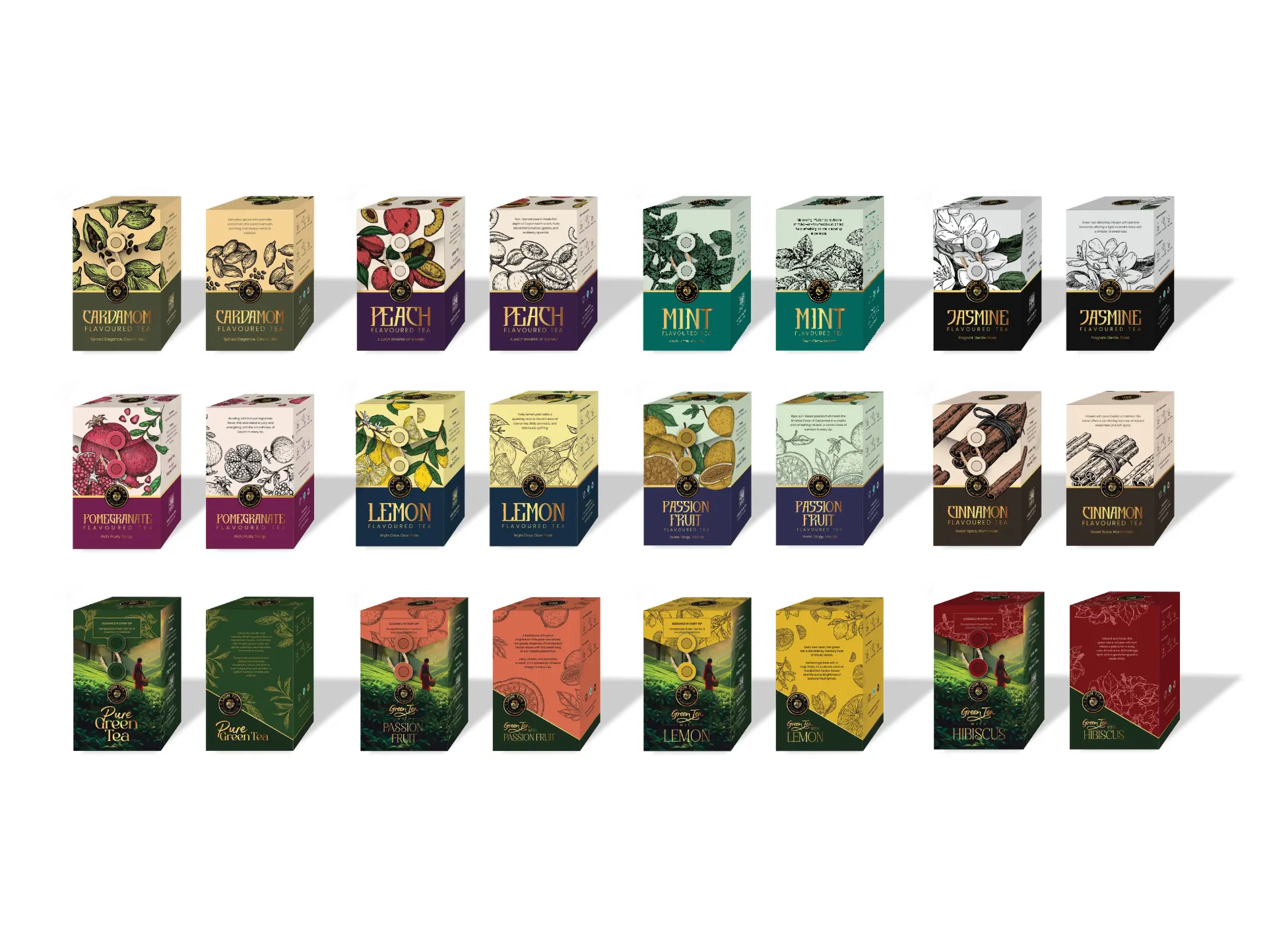
With over 30 variations across different tea categories, each product needed its own identity while remaining recognizably part of Lion Tea. The designs also had to communicate clearly to international buyers, work across multiple packaging formats and hold together as one commercial range.
That meant establishing the positioning first, building a consistent visual system and carrying it through to every detail of the final packaging.
Once the positioning was clear, the next challenge was building a visual system that could survive a lot of SKUs.
Every box couldn't look the same. So we did this by establishing a shared packaging architecture, from brand placement and typography to information hierarchy, illustration style and supporting details, then allowed each tea category and flavor to form its own visual personality within those rules.
Someone could scan the collection and immediately see that everything belonged to Lion Tea, but still be able to distinguish one tea from another.
Here's a closer look at the ranges we worked on.
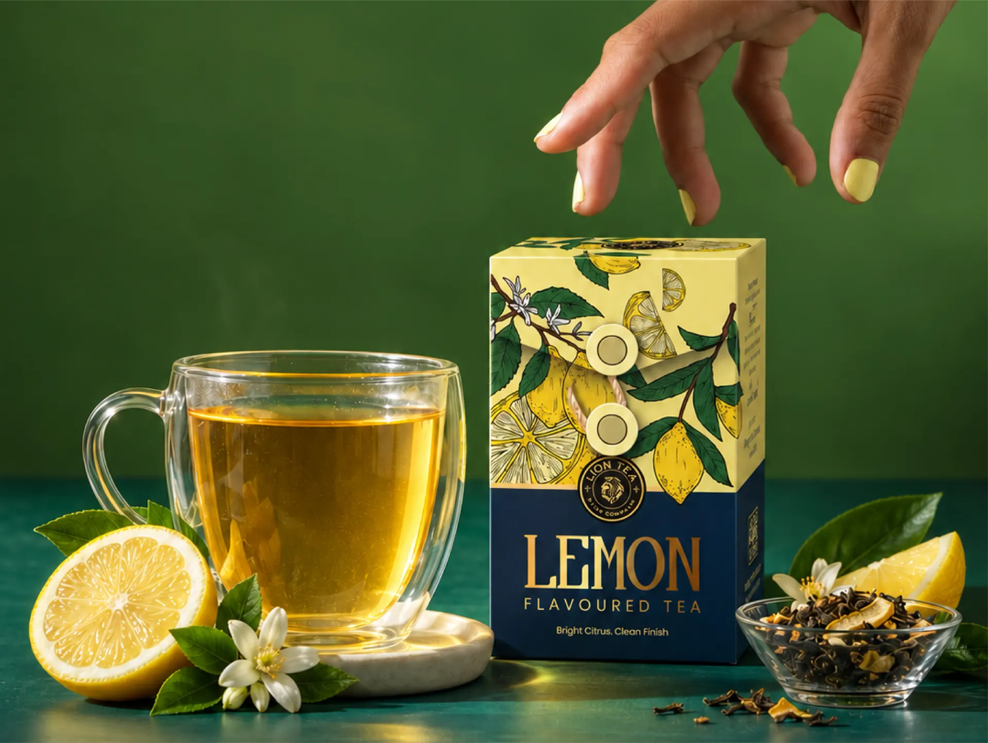
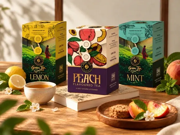
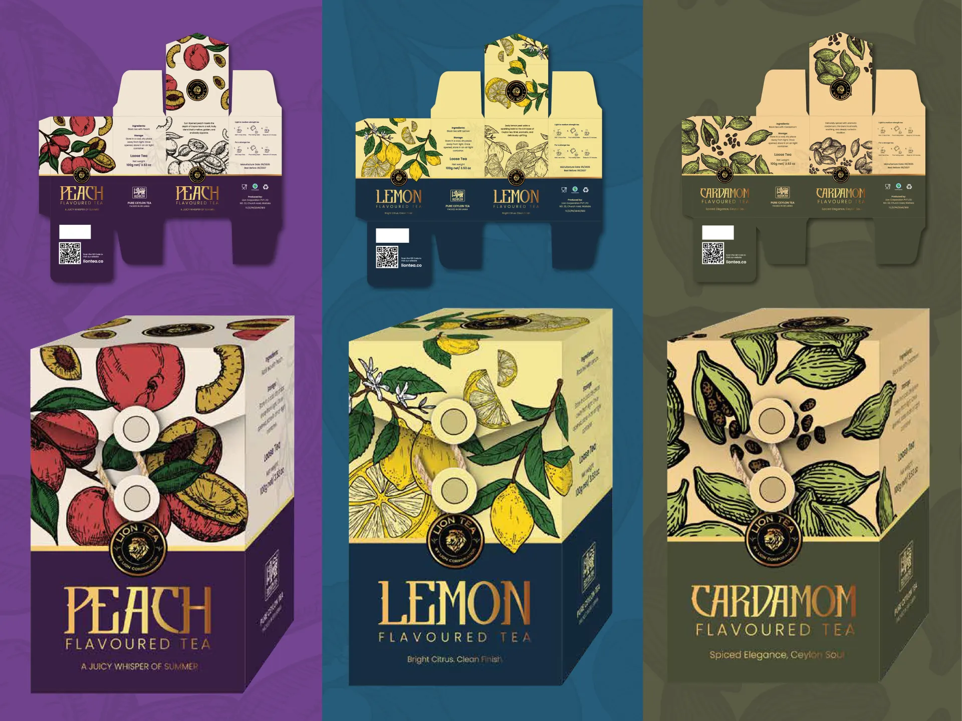
The flavored range gave us the most room to experiment because it covered 3 distinct flavor categories: fruits, herbs and spices and floral teas.
For this range, we used ingredient-led illustration, strong color differentiation and a consistent information hierarchy to make that possible. What we paid special attention to when designing these was what the color and illustration were doing together.
A few examples:
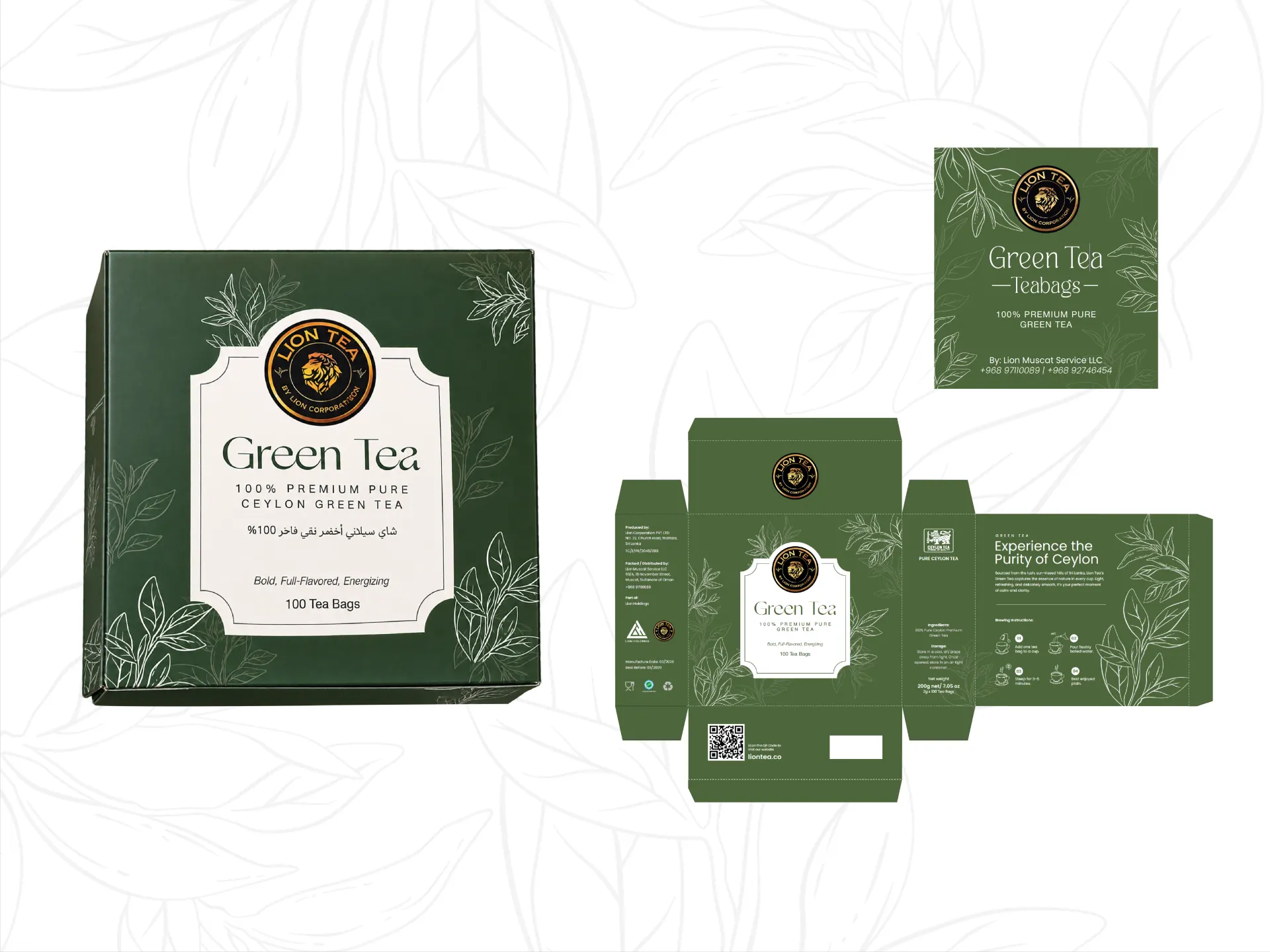
Instead of simply taking the flavored tea system and making everything green, we brought tea provenance and the Ceylon story closer to the front.
Estate imagery, deeper greens and botanical detailing became stronger parts of the system across Pure Green Tea, Passion Fruit, Hibiscus and Lemon.
But we kept the surrounding hierarchy of the pack clean enough to work in an international retail environment.
This gave the range an anchor product that was less about flavor and more about where the tea comes from.
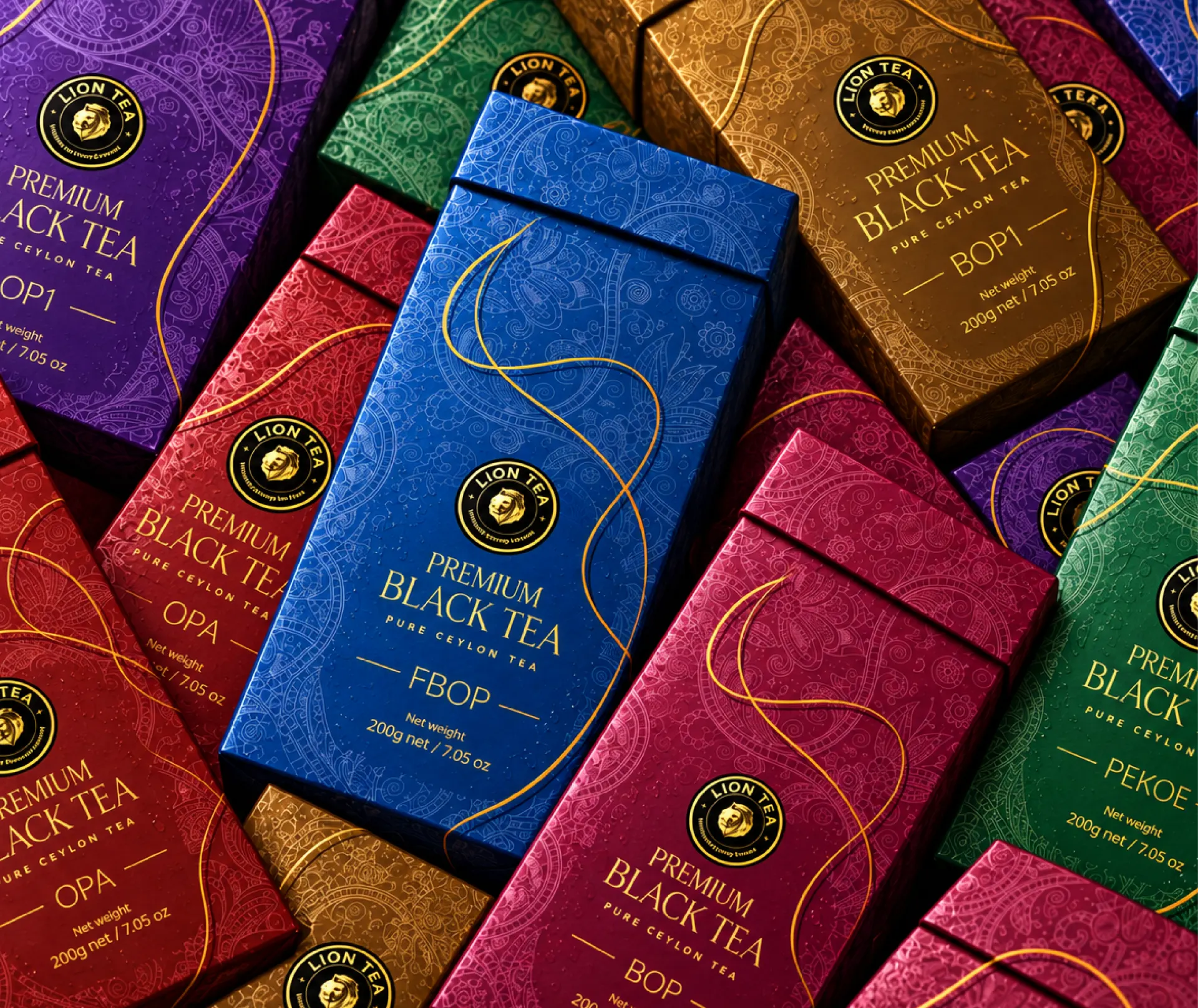
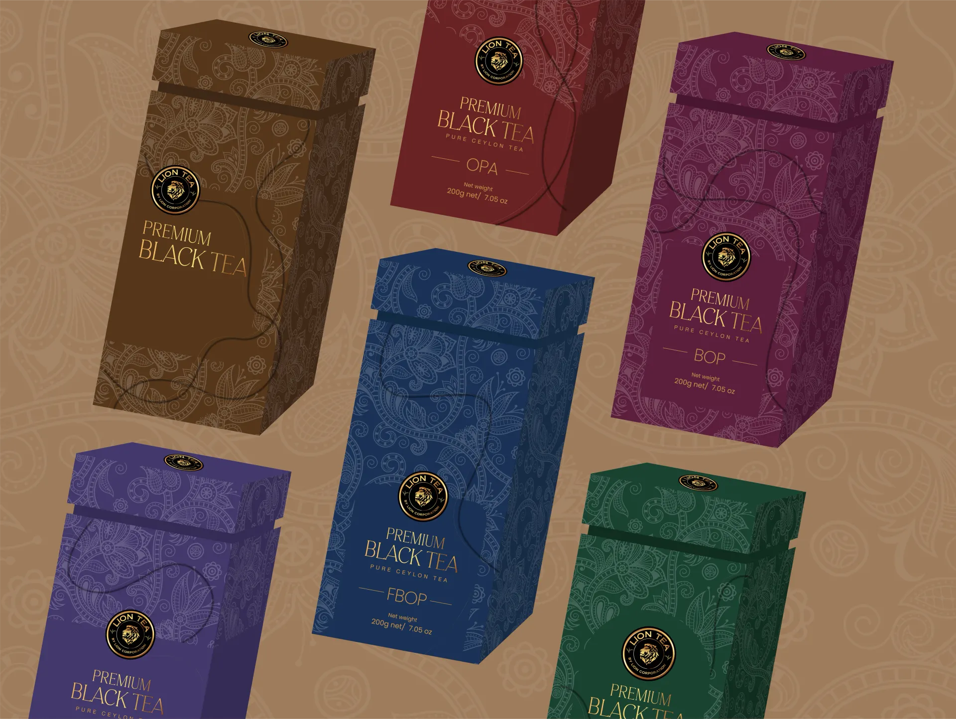
The premium range had a different job. We worked with six grades (OPI, OPA, FBOP, BOP1, BOP and Pekoe), determining the best visual language to accommodate each.
We didn't cover the packs in obvious luxury cues. Premiumization came through color depth, typography, composition and detail. The trick was knowing when to stop.
So we approached it with a more minimal design language, using deeper jewel tones, controlled ornamentation and gold detailing. Together with the taller container structure, these decisions gave the packs a more formal and premium character.
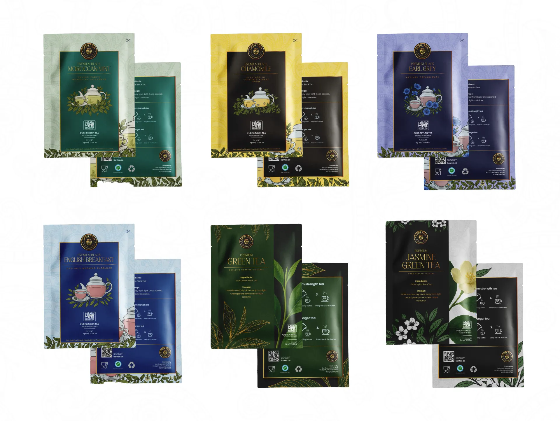
The sachets introduced another packaging challenge: taking a visual system designed for a full carton and making it work at a much smaller scale.
That meant stripping the hierarchy down to what mattered most: brand, tea type, variant and key details.
These sachet designs became an extension of the packaging system rather than just miniature versions of the boxes.
A front panel can look fantastic in a presentation and still fall apart the moment the packaging is actually produced.
We carried the system across the full pack, from the hero product panel to ingredients, brewing information, QR codes, certification marks, brand messaging and supporting information.
It meant thinking about things that are easy to miss in a flat mockup:
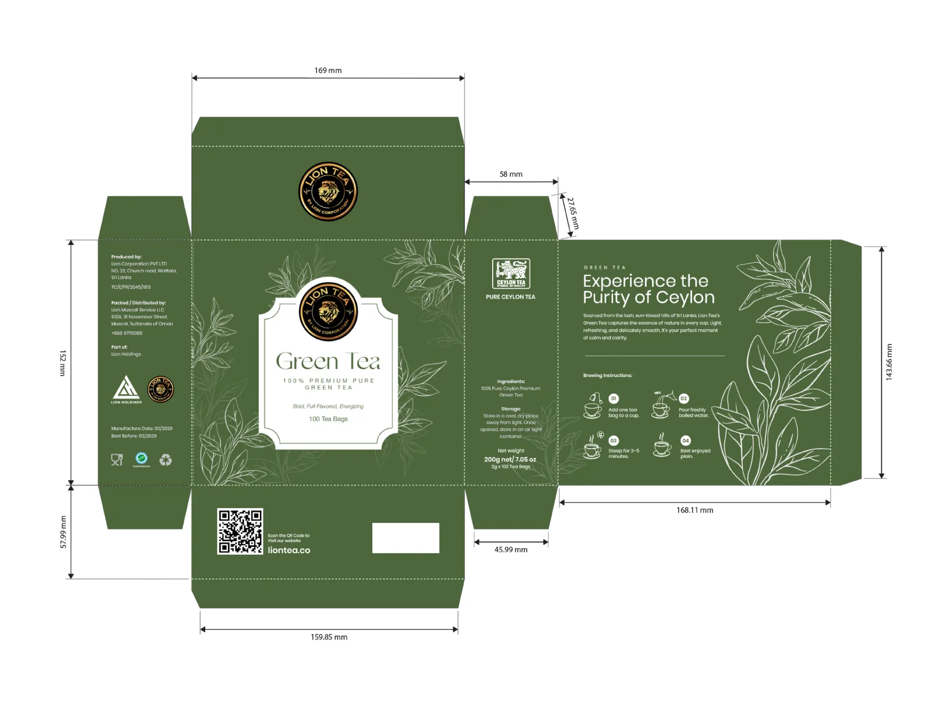
We handled the copywriting alongside the packaging design, making sure the messaging worked just as well for international buyers as it did for everyday consumers.
This meant developing clear product descriptions and export-friendly language that could support conversations with distributors, retailers, hospitality partners and potential white-label customers.
The goal was to make the packaging informative and commercially relevant without overcrowding the design.
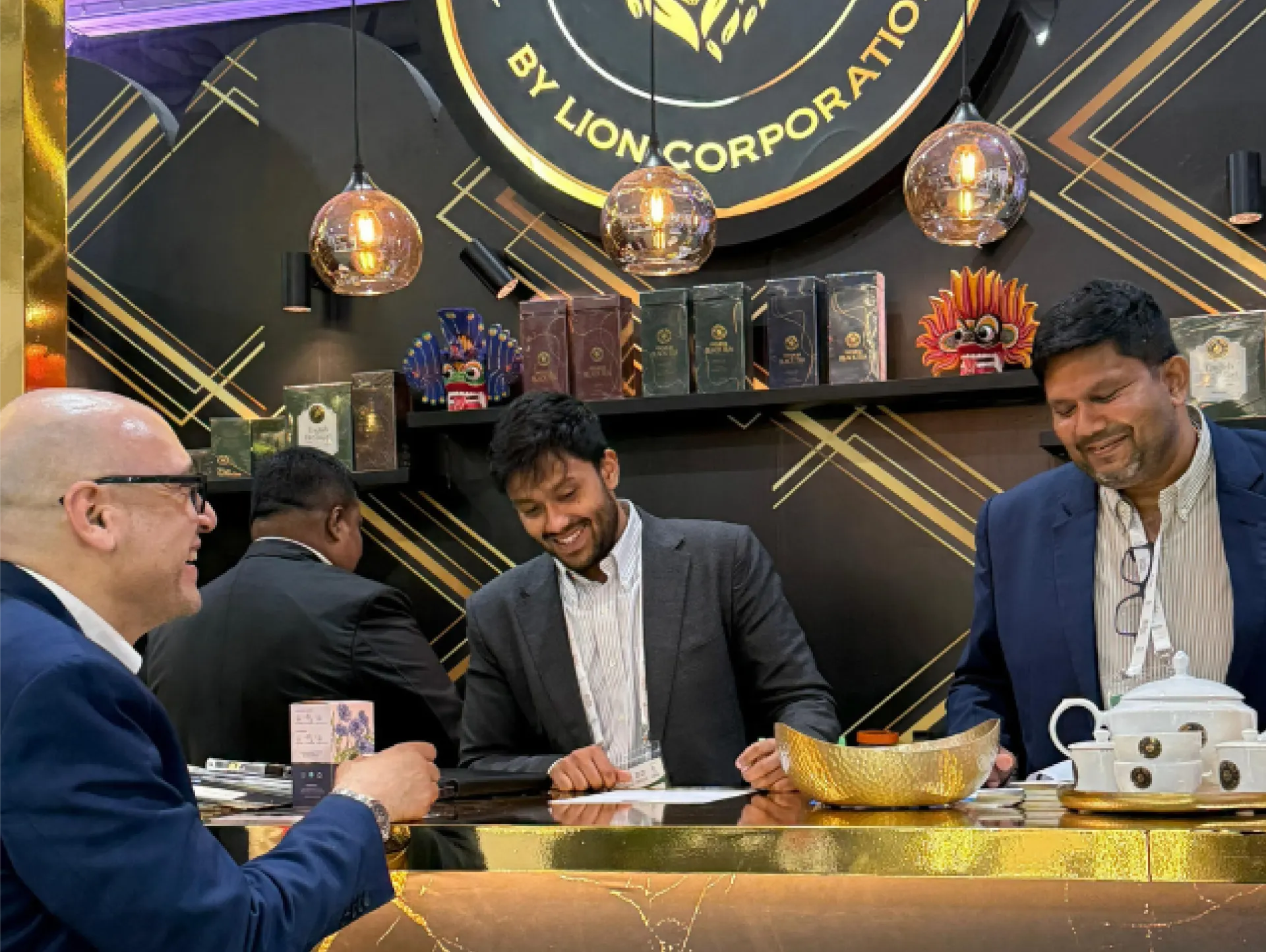
Riyadh Global Food Show
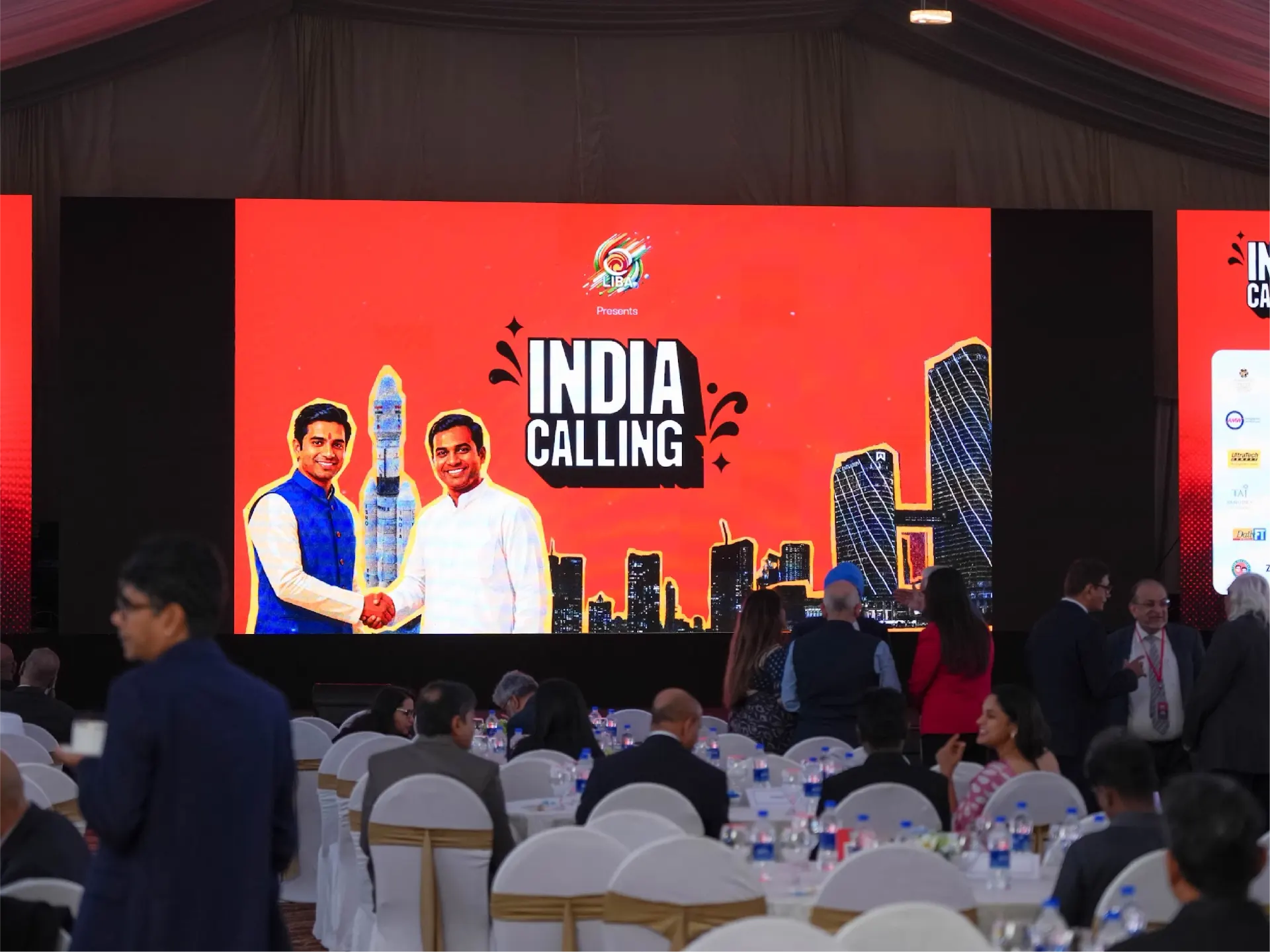
The completed collection was showcased at the Riyadh Global Food Show, putting the packaging in front of potential distributors, buyers and business partners in a real international trade environment.
The full scale of the visual system really came through here.
Instead of presenting one or two polished products, Lion Tea could show a whole commercial range and different packaging formats while maintaining one recognizable brand language.
The supplied project material records distributor interest and new B2B leads coming out of the showcase, with the packaging helping open conversations around the wider Lion Tea offering.
The packaging had done its first job before anyone even tasted the tea.
When the Packaging Became the Pitch
Lion Tea walked into its international trade showcase with a system that gave buyers something concrete to respond to.
They could see the flavors. They could see the grades. They could see the different formats. And they could see that Lion Tea was capable of building a much bigger tea business around them.
All of these designs were delivered in under 3 weeks, giving Lion Tea a complete packaging system ready for its international trade showcase.
Premium Designs Delivered
Packaging Variations
End-to-End Delivery
Built to Travel
Lion Tea reminded us of something packaging projects can sometimes forget:
The box is not the final destination.
It has to survive a shelf, a buyer meeting, a trade show, a distributor conversation and, eventually, somebody deciding whether they want to pick it up. That meant designing a system with enough personality to get noticed, enough structure to make sense and enough flexibility to keep growing. For us, that was the real win.
We didn't just give Lion Tea more packaging. We gave the range a way to show what the business could do.